Plotting Immunostaining Data
In this tutorial we will gernerate a demo immunostaining data and show how to plot it into different types of plots.
Import important libraries
# numerical python
import numpy as np
# dataframe implementation in python
import pandas as pd
# vizualization library in python
import matplotlib.pyplot as plt
# vizualization librariy based on matplotlib
import seaborn as sns
Make a random dataset
Generate a random array
fix a seed value so that resut become reproducible
np.random.seed(8)
generate an array of random integers with 50 rows and 4 columns the lowest and highest number in the array would be 3 and 10 respectively
data=np.random.randint(low=3,high=10,size=(50,4))
this can also be written as simple as data=np.random.randint(3,10,(50,4))
as the data have 4 columns, lets assume they stand for experiemntal conditions and represent column names
header=["WT_IR_0","WT_IR_30","MU_IR_0","MU_IR_30"]
Convert array into a dataframe
make a dataframe by combining the data with header
df=pd.DataFrame(data, columns=header)
Print the first five lines of the data.
This is called wide form of data
df.head()
| WT_IR_0 | WT_IR_30 | MU_IR_0 | MU_IR_30 | |
|---|---|---|---|---|
| 0 | 6 | 7 | 4 | 4 |
| 1 | 8 | 5 | 3 | 6 |
| 2 | 3 | 3 | 8 | 8 |
| 3 | 7 | 4 | 6 | 5 |
| 4 | 6 | 7 | 8 | 4 |
Plotting the data
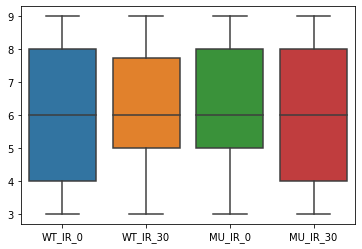
Make a boxplot out of the data
Using the boxplot function of seaborn module generate a boxplot
sns.boxplot(data=df);
Reader may try the following
sns.boxplot(data=df)ommitting the colon";", or just writing
sns.boxplot(df) and see the differences among outputs
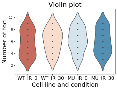
Make a violinplot out of the data
sns.violinplot(data=df, inner="point", palette='RdBu')
plt.title("Violin plot", size=22)
plt.xlabel("Cell line and condition", size=20)
plt.ylabel("Number of foci", size=20)
plt.xticks(size=16)
plt.show()
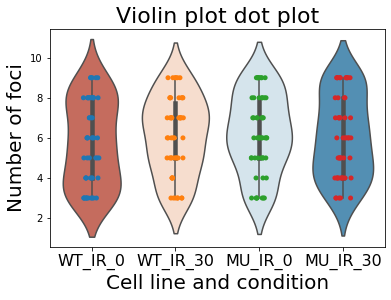
Add dotplot to the violinplot
Sometimes we want to add dot plot with boxplot. To render such plots just add one line of code with the previous block.
sns.violinplot(data=df, palette='RdBu')
sns.stripplot(data=df);
plt.title("Violin plot", size=22)
plt.xlabel("Cell line and condition", size=20)
plt.ylabel("Number of foci", size=20)
plt.xticks(size=16)
plt.show()
Let’s add some more parameters to the previous block and make it pretty.
sns.violinplot(data=df, color='lightgray', inner=None);
sns.swarmplot(data=df, palette='RdBu', marker="^", size=5, linewidth=0.5, edgecolor='black');
plt.title("Violin plot", size=22)
plt.xlabel("Cell line and condition", size=20)
plt.ylabel("Number of foci", size=20)
plt.xticks(size=16)
plt.show()
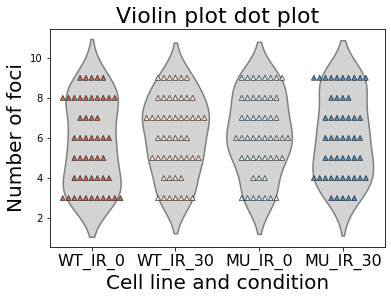
What we did, in the first line changed the color of the individual boxes/violins. In the secomnd line of code we defined parameters for the palette and marker. The marker was set to upperward triangle, size of the marker was set to 8, linewidth of the marker was set to 0.5 and the color of the outer edger was set to black. More of such examples can be found in the following link of seaborn.
Try other different form of plots systematically
custom_pallette=['salmon','cyan','lavender','palegreen']
plot_type= [sns.violinplot,sns.boxplot, sns.boxenplot, sns.swarmplot]

fig,ax = plt.subplots(nrows=2,ncols=2,
                      figsize=(10,10),
                      gridspec_kw={'hspace': 0.3})

for idx, plot in enumerate(plot_type):
    axis=ax.flatten()[idx]
    plot(data=df, ax=axis,palette=custom_pallette)
    axis.set_title(plot.__name__, size=20)
    axis.set_xlabel("Cell line", size=16)
    axis.set_ylabel("# Foci", size=16)
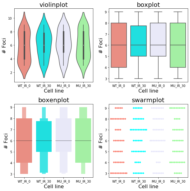
Now breakdown the above code for beginners.
custom_pallette=['salmon','cyan','lavender','palegreen'] this is a custom color palette defined by user.
Then we make a list containing different function from seaborn module in the follwoing line plot_type= [sns.violinplot,sns.boxplot, sns.boxenplot, sns.swarmplot]
we make a figure fig and axes object ax by calling plt.subplots().
nrows=2, ncols=2, defines how many row and columns do I need, figsize=(10,10) set the size of the figure.
grid spec key word arguments gridspec_kw={'hspace': 0.3} tells the function the horizontal spaces 'hspace' will be 0.3 and it determines the space between two rows.
Finally, we call enumerate function on plot_type list and draw the plots.
Because different plots will be on different axes, we declare beforehand it by axis=ax.flatten()[idx]
axis.set_title(plot.__name__, size=20) set the title of each of the sub-plots and sizes of the titles and then the x-axis and y-axis label is defined in the following line
This toturial should help plotting immunopstatining data into meaningful nice plot.