Analyze RNAseq with DESeq2
2022, Aug 03
Introduction
Here we try to use data from SRA project code SRP029880 and analyze to the fullest.
The tutorial is exactly same in CompGenomicR book
Load data
#colorectal cancer
counts_file <- "SRP029880.raw_counts.tsv"
coldata_file <- "SRP029880.colData.tsv"
counts <- as.matrix(read.table(counts_file, header = T, sep = '\t'))
colData <- read.table(coldata_file, header = T, sep = '\t',
                      stringsAsFactors = TRUE)
Look into summary
summary(counts[,1:3])
     CASE_1              CASE_2              CASE_3
 Min.   :        0   Min.   :        0   Min.   :        0
 1st Qu.:     5155   1st Qu.:     6464   1st Qu.:     3972
 Median :    80023   Median :    85064   Median :    64145
 Mean   :   295932   Mean   :   273099   Mean   :   263045
 3rd Qu.:   252164   3rd Qu.:   245484   3rd Qu.:   210788
 Max.   :205067466   Max.   :105248041   Max.   :222511278
calculate TPM
# create a vector of gene lengths
geneLengths <- as.vector(subset(counts, select = c(width)))

#find gene length normalized values
rpk <- apply( subset(counts, select = c(-width)), 2,
              function(x) x/(geneLengths/1000))
#normalize by the sample size using rpk values
tpm <- apply(rpk, 2, function(x) x / sum(as.numeric(x)) * 10^6)
Perform clustering
Perform Clustering with TPM values for quality check:
- Let’s select the top 100 most variable genes among the samples.
- compute the variance of each gene across samples
V <- apply(tpm, 1, var)
#sort the results by variance in decreasing order
#and select the top 100 genes
selectedGenes <- names(V[order(V, decreasing = T)][1:100])
suppressMessages(library(pheatmap))
options(repr.plot.width=8, repr.plot.height=8)
pheatmap(tpm[selectedGenes,], scale = 'row',
         show_rownames = FALSE,
         annotation_col = colData)
Perform PCA
suppressMessages(library(stats))
suppressMessages(library(ggplot2))

#transpose the matrix
M <- t(tpm[selectedGenes,])
# transform the counts to log2 scale
M <- log2(M + 1)
#compute PCA
pcaResults <- prcomp(M)

#plot PCA results making use of ggplot2's autoplot function
#ggfortify is needed to let ggplot2 know about PCA data structure.
# autoplot(pcaResults, data = colData, colour = 'group')
options(repr.plot.width=8, repr.plot.height=6)
dtp <- data.frame('group' = colData$group, pcaResults$x[,1:2]) # the first two componets are selected (NB: you can also select 3 for 3D plottings or 3+)
ggplot(data = dtp) +
       geom_point(aes(x = PC1,
                      y = PC2,
                      col = group),
                  size=4
                 )
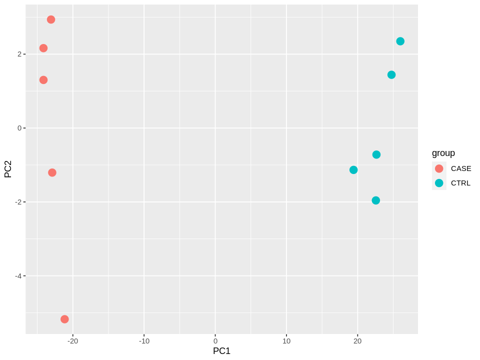
summary(pcaResults)
Importance of components:
                          PC1     PC2     PC3     PC4     PC5    PC6     PC7
Standard deviation     24.396 2.50514 2.39327 1.93841 1.79193 1.6357 1.46059
Proportion of Variance  0.957 0.01009 0.00921 0.00604 0.00516 0.0043 0.00343
Cumulative Proportion   0.957 0.96706 0.97627 0.98231 0.98747 0.9918 0.99520
                           PC8     PC9      PC10
Standard deviation     1.30902 1.12657 4.362e-15
Proportion of Variance 0.00276 0.00204 0.000e+00
Cumulative Proportion  0.99796 1.00000 1.000e+00
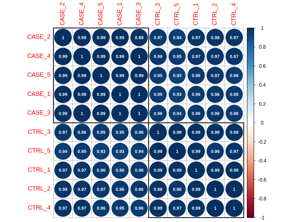
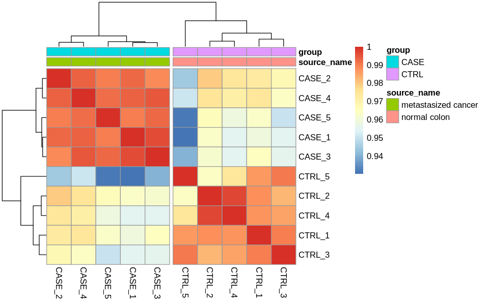
Correlation plots
suppressMessages(library(stats))
correlationMatrix <- cor(tpm)
suppressMessages(library(corrplot))
corrplot(correlationMatrix, order = 'hclust',
         addrect = 2, addCoef.col = 'white',
         number.cex = 0.7)
options(repr.plot.width=8, repr.plot.height=5)
# split the clusters into two based on the clustering similarity
pheatmap(correlationMatrix,
         annotation_col = colData,
         cutree_cols = 2)
Differential expression analysis
With DESeq2
suppressMessages(library(DESeq2))
#remove the 'width' column
countData <- as.matrix(subset(counts, select = c(-width)))
#define the experimental setup
colData <- read.table(coldata_file, header = T, sep = '\t',
                      stringsAsFactors = TRUE)
#define the design formula
designFormula <- "~ group"
create a DESeq dataset object from the count matrix and the colData
dds <- DESeqDataSetFromMatrix(countData = countData,
                              colData = colData,
                              design = as.formula(designFormula))
#print dds object to see the contents
print(dds)
converting counts to integer mode


class: DESeqDataSet
dim: 19719 10
metadata(1): version
assays(1): counts
rownames(19719): TSPAN6 TNMD ... MYOCOS HSFX3
rowData names(0):
colnames(10): CASE_1 CASE_2 ... CTRL_4 CTRL_5
colData names(2): source_name group
Remove genes that have almost no information in any of the given samples.
#For each gene, we count the total number of reads for that gene in all samples
#and remove those that don't have at least 1 read.
dds <- dds[ rowSums(DESeq2::counts(dds)) > 1, ]
dds <- DESeq(dds)
estimating size factors

estimating dispersions

gene-wise dispersion estimates

mean-dispersion relationship

final dispersion estimates

fitting model and testing
Now, we can compare and contrast the samples based on different variables of interest. In this case, we currently have only one variable, which is the group variable that determines if a sample belongs to the CASE group or the CTRL group.
#compute the contrast for the 'group' variable where 'CTRL'
#samples are used as the control group.
DEresults = results(dds, contrast = c("group", 'CASE', 'CTRL'))
#sort results by increasing p-value
DEresults <- DEresults[order(DEresults$pvalue),]
Let’s have a look at the contents of the DEresults table.
#shows a summary of the results
print(DEresults)
log2 fold change (MLE): group CASE vs CTRL
Wald test p-value: group CASE vs CTRL
DataFrame with 19097 rows and 6 columns
            baseMean log2FoldChange     lfcSE       stat       pvalue
           <numeric>      <numeric> <numeric>  <numeric>    <numeric>
CYP2E1       4829889        9.36024  0.215223    43.4909  0.00000e+00
FCGBP       10349993       -7.57579  0.186433   -40.6355  0.00000e+00
ASGR2         426422        8.01830  0.216207    37.0863 4.67898e-301
GCKR          100183        7.82841  0.233376    33.5442 1.09479e-246
APOA5         438054       10.20248  0.312500    32.6479 8.58227e-234
...              ...            ...       ...        ...          ...
CCDC195      20.4981      -0.215607   2.89255 -0.0745386           NA
SPEM3        23.6370     -22.154752   3.02785 -7.3169986           NA
AC022167.5   21.8451      -2.056240   2.89545 -0.7101618           NA
BX276092.9   29.9636       0.407326   2.89048  0.1409199           NA
ETDC         22.5675      -1.795274   2.89421 -0.6202983           NA
                   padj
              <numeric>
CYP2E1      0.00000e+00
FCGBP       0.00000e+00
ASGR2      2.87741e-297
GCKR       5.04945e-243
APOA5      3.16669e-230
...                 ...
CCDC195              NA
SPEM3                NA
AC022167.5           NA
BX276092.9           NA
ETDC                 NA
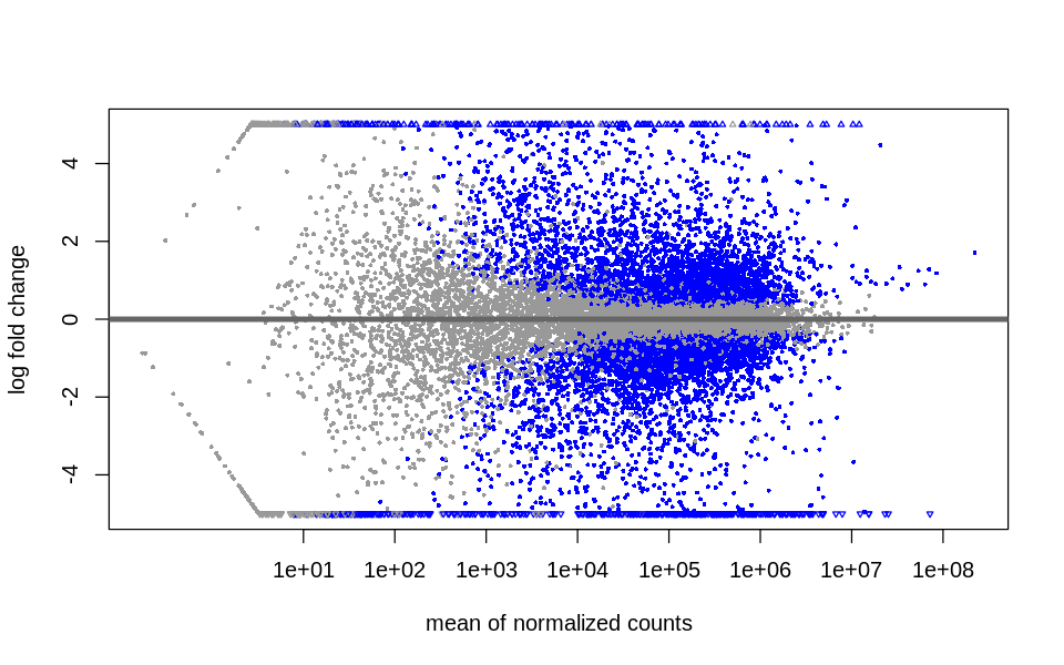
Diagnostic plots
MA plot
DESeq2::plotMA(object = dds,
               ylim = c(-5, 5),
#                colNonSig = "gray60",
#                colSig = "cyan"4

              )
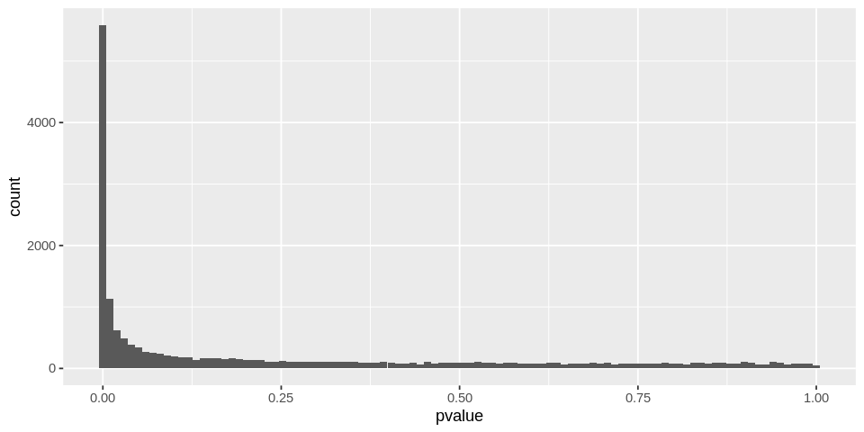
P-value distribution
options(repr.plot.width=8, repr.plot.height=4)
ggplot(data = as.data.frame(DEresults), aes(x = pvalue)) +
  geom_histogram(bins = 100)
Warning message:
“Removed 648 rows containing non-finite values (stat_bin).”
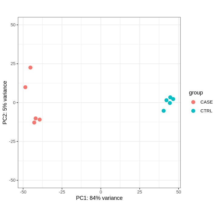
PCA-plot after DESeq2 normalization
# extract normalized counts from the DESeqDataSet object
countsNormalized <- DESeq2::counts(dds, normalized = TRUE)

# select top 500 most variable genes
selectedGenes <- names(sort(apply(countsNormalized, 1, var),
                            decreasing = TRUE)[1:500])
# NOT WORKING
# plotPCA(countsNormalized[selectedGenes,],
#         col = as.numeric(colData$group), adj = 0.5,
#         xlim = c(-0.5, 0.5), ylim = c(-0.5, 0.6))
options(repr.plot.width=6, repr.plot.height=6)
rld <- rlog(dds)
DESeq2::plotPCA(rld,
                ntop = 500,
                intgroup = 'group') +
        ylim(-50, 50) +
        theme_bw()
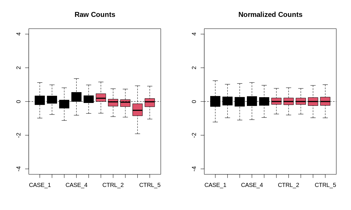
Relative Log Expression (RLE) plot
suppressMessages(library(EDASeq))
options(repr.plot.width=10, repr.plot.height=6)
par(mfrow = c(1, 2))
plotRLE(countData, outline=FALSE, ylim=c(-4, 4),
        col=as.numeric(colData$group),
        main = 'Raw Counts')
plotRLE(DESeq2::counts(dds, normalized = TRUE),
        outline=FALSE, ylim=c(-4, 4),
        col = as.numeric(colData$group),
        main = 'Normalized Counts')
Functional enrichment analysis
wait for more…